All About YIP
Best of YIP Magazine
YIP Magazine Archives
YIP WaReZ!!1
Moray Eel Approved Links
by Milky
Icons are like fire: their potential for good is rivaled only by their potential for evil. Icons can protect us from harm, or entice us onward towards disaster and a horrible death. Here now is an unbiased and detailed examination of some of today's top icons, and an evaluation of their service towards humanity.
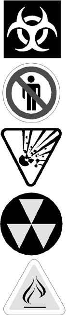 |
(1) This icon is supposed to mean "biohazard". Where exactly is the biohazard in this picture? I looked for a long time, but all I see is a ring and some weird throwing star. Because of the designer's fondness for abstract expression, some kid is probably eating ebola right now. (2) What the hell is this? No people? No men? No standing? No jocks? (The stump man has shoulders, which is something of an aberration.) I have no clue. All I can say is that the designer of this icon was probably a loner. (3) Now this is an icon. The "Explosive" icon is a clear, dynamic and in some ways beautiful picture of an explosion. You look at this baby and instantly think "A-ha! Explosive! Maybe I'll use wood for the fire instead of aerosol cans." (4) "Watch out: poorly stacked triangles ahead"? I asked around and no-one had a clue what horrid fate these inverted triangles might be warning against. Really, the only safe course is to run away screaming whenever you see this icon. (5)Though its intent is noble, this icon is probably more trouble than it's worth. Though it is almost certainly trying to say "no matches", what this icon actually winds up saying is "caution: match area", which will just encourage people to light matches near the sign.
|
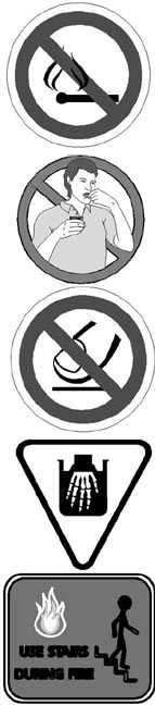 |
(6) Though the match and some of its smoke appear to be behind the red bar, as is proper, one wisp of smoke is clearly in front of the red bar! While it may be very "swanky" to have M.C. Escher create your icon, this design is a violation iconic law. If it ain't crossed out, it's legal, baby! (7) If I was teaching a course on how not to design icons, the "no tobacco" logo would be the illustration on the textbook's cover. The boy - who lacks the proper circular head and stump limbs - stands in front of the bar, meaning that his behaviour (whatever that might be!) is proper! (8) Though at least the designer of this icon understood the basic principles behind forbidding something, exactly what he was forbidding is anyone's guess. No thumbs/no severed thumbs? No touching lines? No pushing things? We can only guess. (9) "Corrosive" is another classic icon. Look how thick and nice the hand was before it plunged recklessly into the corrosive fluid! Look how thin and bony it is afterwards! Who wants that? No-one! I've never had my flesh corroded, but after looking at this icon, I'm not eager to try it! (10) First off, any icon designer who needs to use words is a loser. Second, the art here sucks. The fire is pathetic. The stump man has a neck and feet (definite iconic no-no's) and looks like a retard. I would ride an elevator up and down for the duration of a fire just to spite this dumb icon.
|
![]()
![]()
![]()
If you like anything here, or if you don't, please e-mail milky@yip.org. It's more fun than a kick in the head. Well, not really, but I can dream, can't I?